Showing posts with label ashley lulo. Show all posts

Tuesday, November 10, 2015

Soap N' Stuff Touchpoints

The touchpoints that I will focus on making for Soap N' Stuff are packaging labels, shipping labels, website, and a brochure. The only label I have yet to make are the labels for the reed diffusers. The packaging labels are there to further push the brand and to let the receiver know that their products have arrived. The website lets the user order their products, get ingredients for the product, and other information on the product as well as how to ingredients are helpful for the product and the user. The brochure will also be sent in with all of the packages with coupons and a list of all of the products offered. The brochure will be a double sided 11 x 17.

Labels:


 The labels identify the products scent and uses for the product. All the labels will be printed on a gloss sticker. The candle labels will be 8 in long, with a secondary label that goes in line with the long label which will have a top and bottom extension that has the company name on the top and the candle info on the bottom portion (4 in x 2.25 in). On the lid of the candles the company logo will be placed (2.25 in diameter). The are 46 different scents and they will be printed as needed. 

 The brown sugar facial scrub label is 6 in x .75 in with a secondary label that goes in line with the long label which will have a top and bottom extension that has the company name on the top and the directions of use on the bottom portion (1.25 in x 1.5 in). The company logo sticker will exist on the top with a 1.5 in diameter.  The blemish remover label is 4.5 in x .75 in with a secondary label that goes in line with the long label which will have a top and bottom extension that has the company name on the top and the directions of use on the bottom portion (1.25 in x 1.5 in). The black head remover label is 6.25 in x .75 in with a secondary label that goes in line with the long label which will have a top and bottom extension that has the company name on the top and the directions of use on the bottom portion (1.25 in x 1.5 in).

 
 The lavender body butter label is 6 in x .75 in with a secondary label that goes in line with the long label which will have a top and bottom extension that has the company name on the top and the directions of use on the bottom portion (.75 in x .75 in). The company logo sticker will exist on the top with a 1.5 in diameter.  The calendula salve label is 7.5 in x .5 in with a secondary label that goes in line with the long label which will have a top and bottom extension that has the company name on the top and the directions of use on the bottom portion (1 in x 1 in). The company logo sticker will exist on the top with a 1.5 in diameter. The Soap labels are 8 in x 1.25 in, that will be transferred or printed on a brown paper. On the back of the label holding the paper together will be a sticker of the company logo.


Website:


The touchpoints have an elegant yet youthful feel as do the logo and is the goal of the whole brand. All the touchpoints are using the fonts according to brand guidelines, using brand colors and following the photography guidelines of the brand of warmth and calming.

I could potentially make the elements of the website more organic at the risk of it not working, it is something to play with. The labels of everything but the candles could use more customization to make them more consistent with the candle labels and have more sense of organic as the candle labels do using illustration as a pattern.


The website and brochure direct/drive to the products. The life cycle of the brand is a long lasting design due to simplicity and elegance of the design. The touchpoints are simple to understand and read and provide needed information to assist the user in how to use, purchase, and the benefits of the products.

This brand is sustainable because the production is made to be affordable, since it is a small one employee company with not a lot of available expenses. The labels can be ordered in bulk easily and are in multiple parts to be cheaper to produce. The website can be sustained by a small fee to be kept online through a domain hosting site. All paper the used and labels are produced on eco-friendly paper to help with the brands value of organic. The designs and materials are sustainable socially because they are not harmful to the earth, the products are healthy and good to the user and the design is simple, pleasing to the eye and provide information easily.

Tuesday, October 27, 2015

Soap N' Stuff : By Pattie Ann


Soap N' Stuff is a company that sells scented home and body products such as candles and body butters. Most candles can also be used as a skin lotion. They are a company that is elegant soft and all the products a completely natural. The logo is a flower that makes up the initials of the company as well as a flower and has embellishments that come off of it that resemble scents which is an aspect strongly associated with the brand and its products. The icons are rendered in full color and I will also have a line-work version. The fonts used in the logo are Odstemplik and Allura, and they are also display types. For the headers and body copy Quicksand and Gill Sans can be used. This brand will have lots of product labeling and shipping packaging, along with a strong online presence, with a mobile compatible website. The brand has a sense of elegance, organic-ness and simplicity.

Friday, October 16, 2015

Starbucks - Identity Design Analysis

Mission Statement:

To inspire and nurture the human spirit – one person, one cup and one neighborhood at a time.

Values:

Creating a culture of warmth and belonging, where everyone is welcome.

Acting with courage, challenging the status quo and finding new ways to grow our company and each other.

Being present, connecting with transparency, dignity and respect.

Delivering our very best in all we do, holding ourselves accountable for results.

We are performance driven, through the lens of humanity.


Advertisement/ Product Photography


Life Style


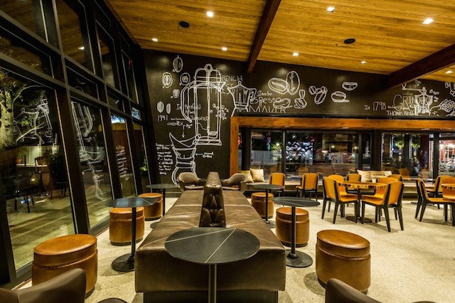
Store


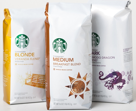
Packaging


Starbucks with its warm and inviting feel and strong drawing aroma does a good job of drawing in its
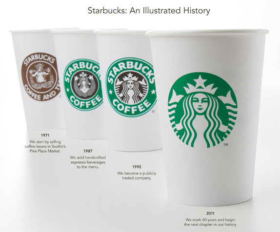
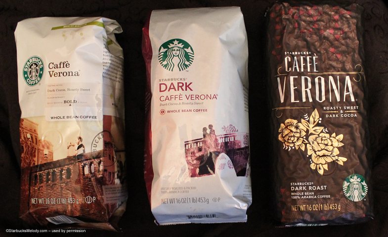
culture successfully. The original mark and the ones following were created by Terry Heckler and Heckler Associates and this mark, imagery, product design, and store design create this warm feeling that really invite people in and then the strong aroma that just permeates the shop and its close exterior really draws people in. The design of the packaging and products has this natural feel, using lots of floral and natural and warm tones. The culture of Starbucks is kind of eclectic which is great because they draw in almost all kinds of customers. Starbucks also has this air of sophistication that helps with their culture because it makes people feel like they are getting super high-end coffee without super high-end prices. Starbucks is a brand that is inviting yet sophisticated with a class that is accessible to everyone, with their use of San-serifs and scripts to give this feel of modern sophistication.


Monday, September 28, 2015

Soap n' Stuff by Patti Ann - Ashley Lulo

Soap n’ Stuff is a small word of mouth company run by Patti A. McBride that has been selling body products and air fresheners that are completely chemical free since 1995. Everything is homemade with all natural products that are skin safe and without harsh chemicals. Soap n’ Stuff sells soaps, bath salts, calendula salve, soy candles, and reed diffusers. Patti started this business because she wanted to make products that didn’t have chemicals in them because she wanted to remove them from her own life and help others accomplish that as well. The mission is to create soaps, bath and beauty products, candles, reed diffusers and salves that are all natural, using organic botanical or pure essential oils for scents, making them chemical free, to help people to breakaway from harmful chemicals and to educate them about what chemicals in products are dangerous. The brand really focuses on being organic, open, simple, and educational, so the identity should exemplify this along with a softness like the products give the skin, organic shapes and earthy tones to further push the organicness of the products, along with an approachable vibe that helps give the idea that the products are for everyone.

Tuesday, September 22, 2015

Soap n' Stuff - Ashley Lulo

Major Competitors:

Beauty.com


Major Stakeholders:
  1. Women
  2. Soap n' Stuff
  3. Patti McBride 
Brand in Current Market:
The advantages that Soap n' Stuff has over the current market are that it is all home made and from a small business that appeals to a number of people. Another advantage is that there is a large variety of scents that can be applied to most products.

Solution Benefits:

By giving my client a website and new look I believe that every stakeholder will benefit. The women will be given a large variety of natural body care products that they can enjoy. Soap n' Stuff and Patti McBride will benefit from the rise in sales caused by a new look and a more noticeable brand.
Wednesday, September 16, 2015

POV Rewrite: Soap n' Stuff

Women interested in natural body care products need a way to know what they are buying is actually natural and without harmful chemicals because they want to look and feel young for a long time and products with harsh chemicals do not allow them to accomplish this, such as, many store bought products, that are supposedly all natural, body care products.

Tuesday, September 15, 2015

POV: Soap N' Stuff

Women of all ages  

need a way to find and purchase natural body care and air freshener products that are not harmful for their body 

because most products found in stores, even the supposedly organic and all natural ones usually still have chemicals in them that are harmful to their bodies.